Solution · Store listing design

App store screenshot design that sells the install in one scroll

Your store listing is a row of images people scroll past in seconds. We design screenshot sets that pair one real screen with one reason to install, laid out separately for each device size — like the set we made for Lucrum CRM.

Screenshots in one set
15
Device sizes
1290×2796 · 1242×2208 · 2048×2732
Starts from
$1,200
Typical timeline
1–3 weeks per campaign
Real work · from the portfolio
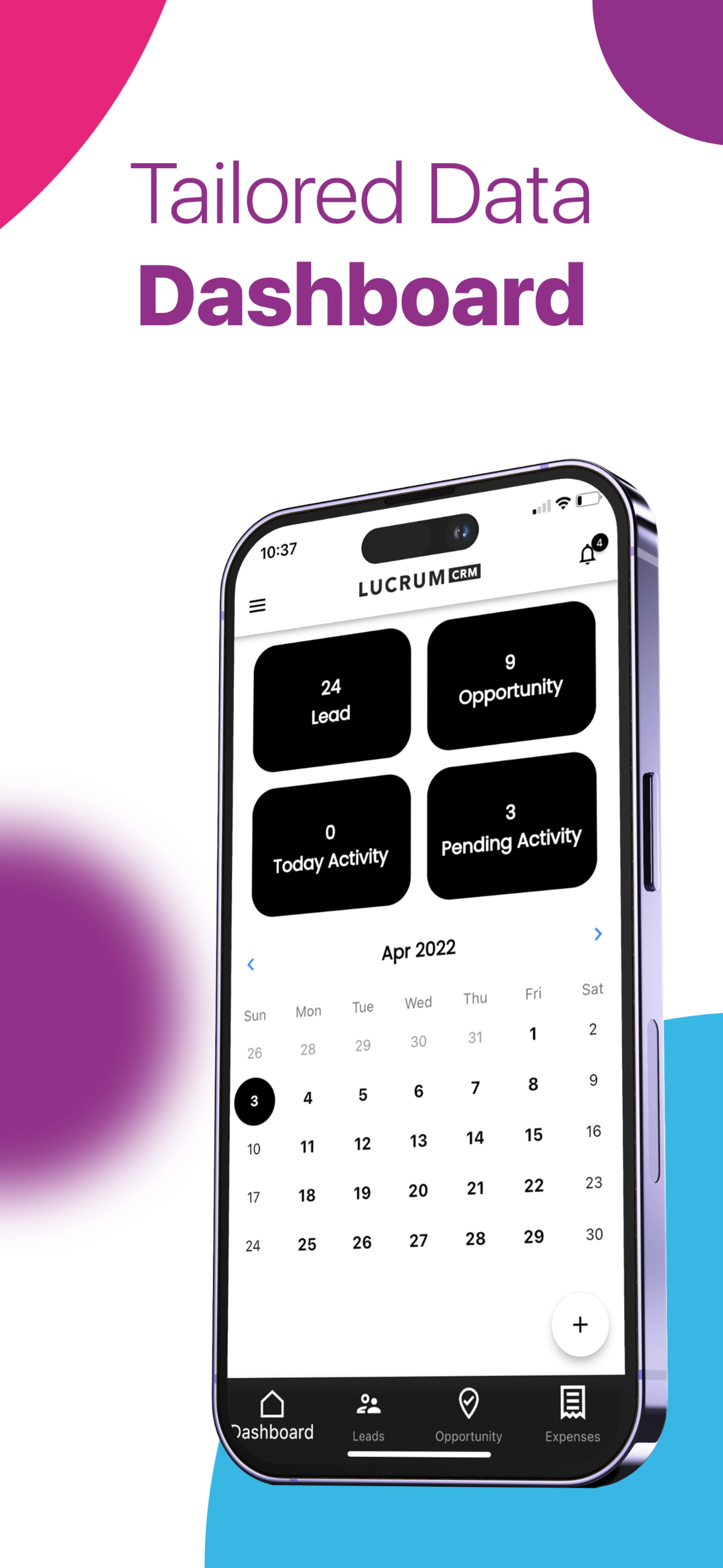
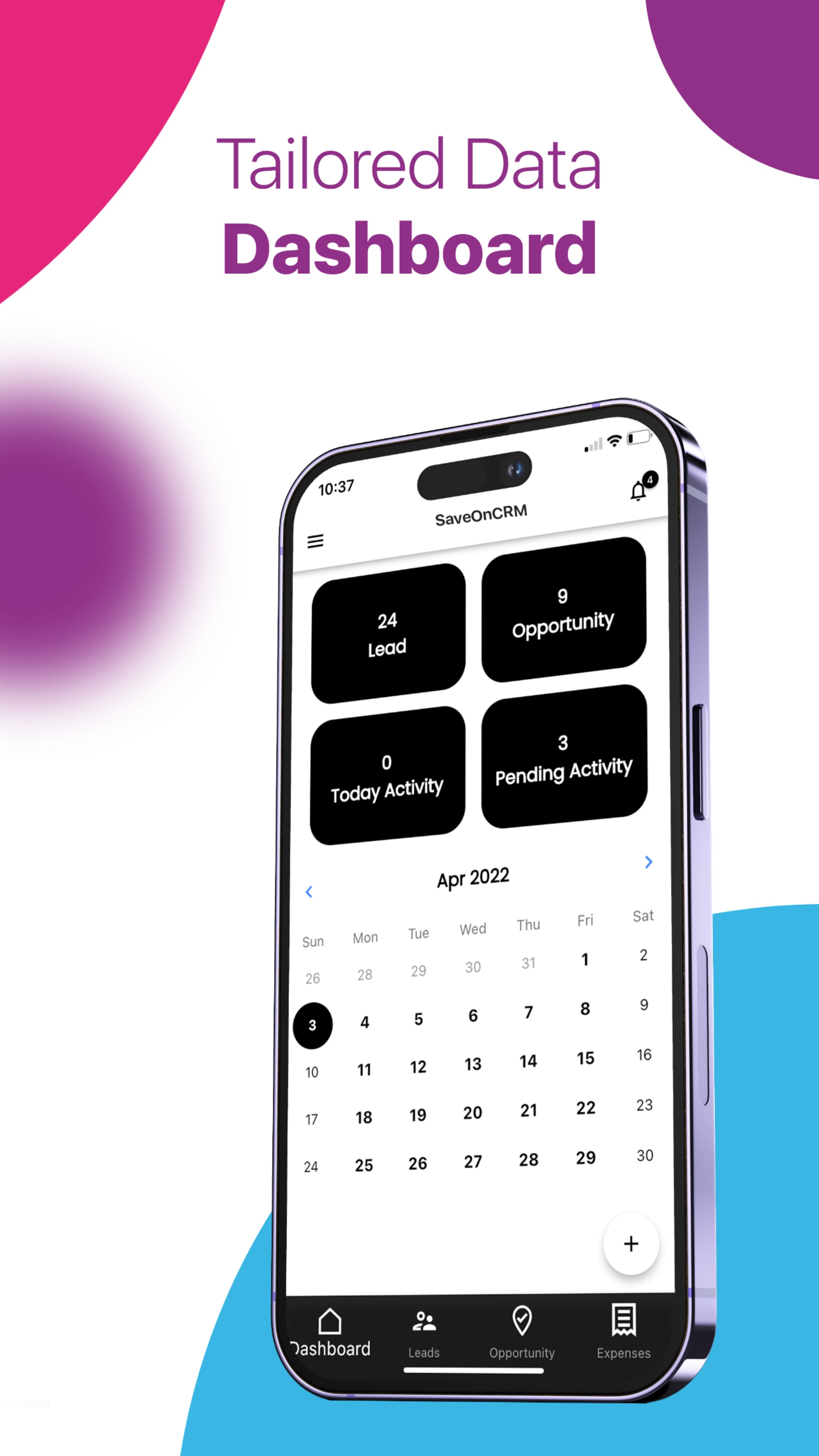
iPhone — “Tailored Data Dashboard”1290×2796
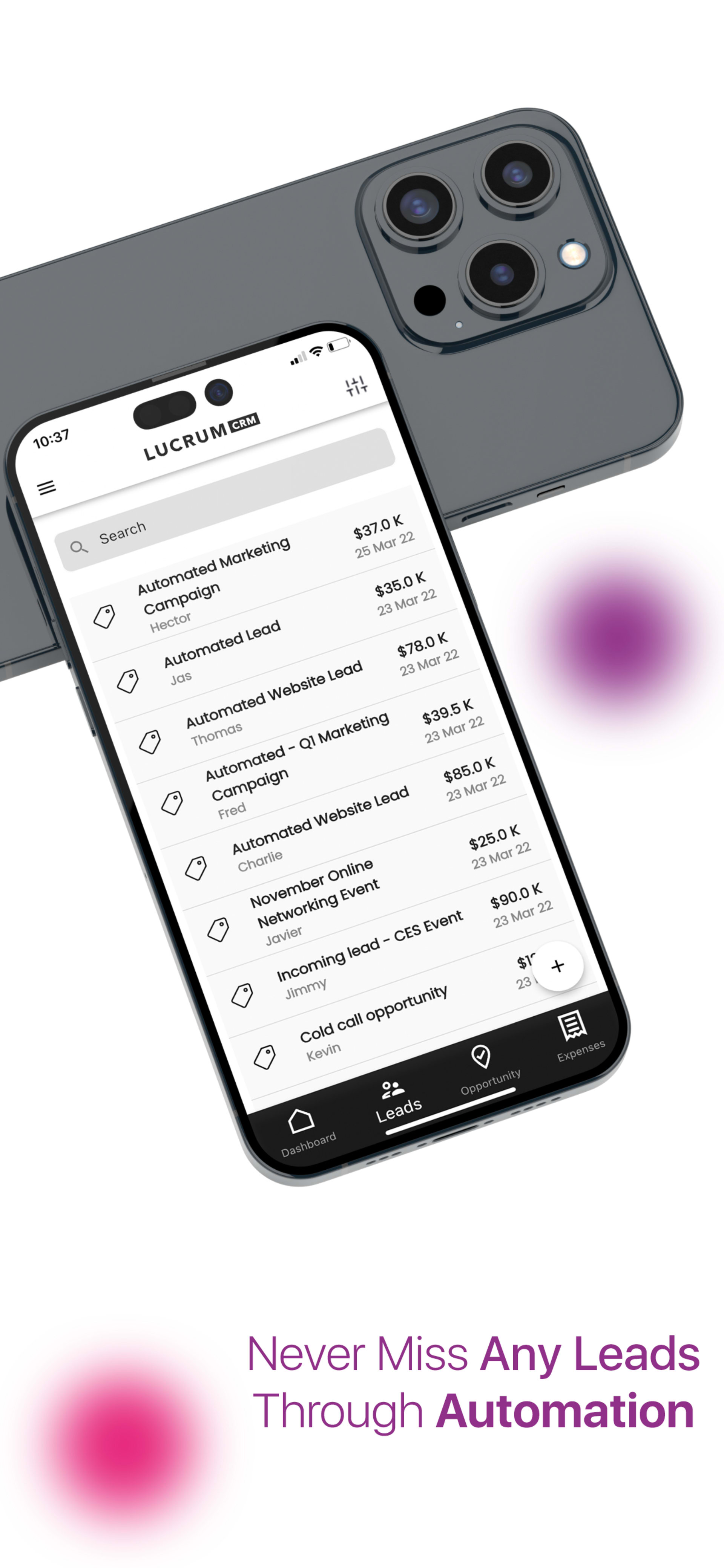
iPhone — “Never Miss Any Leads Through Automation”1290×2796
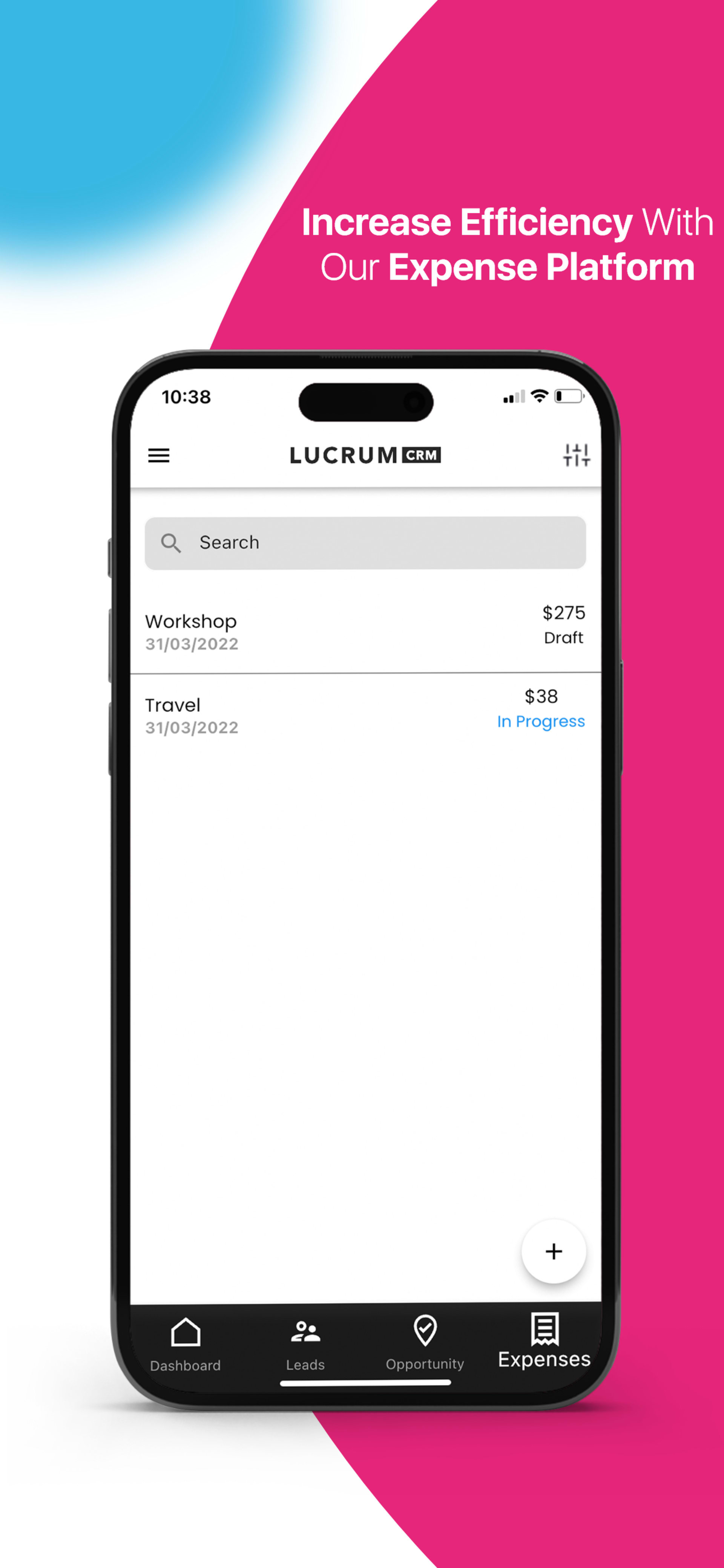
iPhone — “Increase Efficiency With Our Expense Platform”1290×2796

Deliverables

What a screenshot set includes

A complete listing set, designed as a sequence rather than a pile of separate images.

  • 01

    One headline per screen

    Each screenshot makes a single claim — “Tailored Data Dashboard”, “Never Miss Any Leads Through Automation” — set large enough to read in search results.

    One benefit each
  • 02

    Real screens in device frames

    Your actual interface placed in iPhone and iPad frames, tilted and layered differently so a scrolling row of screenshots never repeats.

    iPhone · iPad
  • 03

    A layout per device size

    Each store size is laid out on its own canvas rather than scaled, because a tall phone frame and a near-square iPad frame crop very differently.

    Re-laid, not resized
  • 04

    A first-three story

    The opening screenshots carry the core pitch, because they are the ones visible in search before anyone taps into the listing.

    Search-first order
  • 05

    Brand and market variants

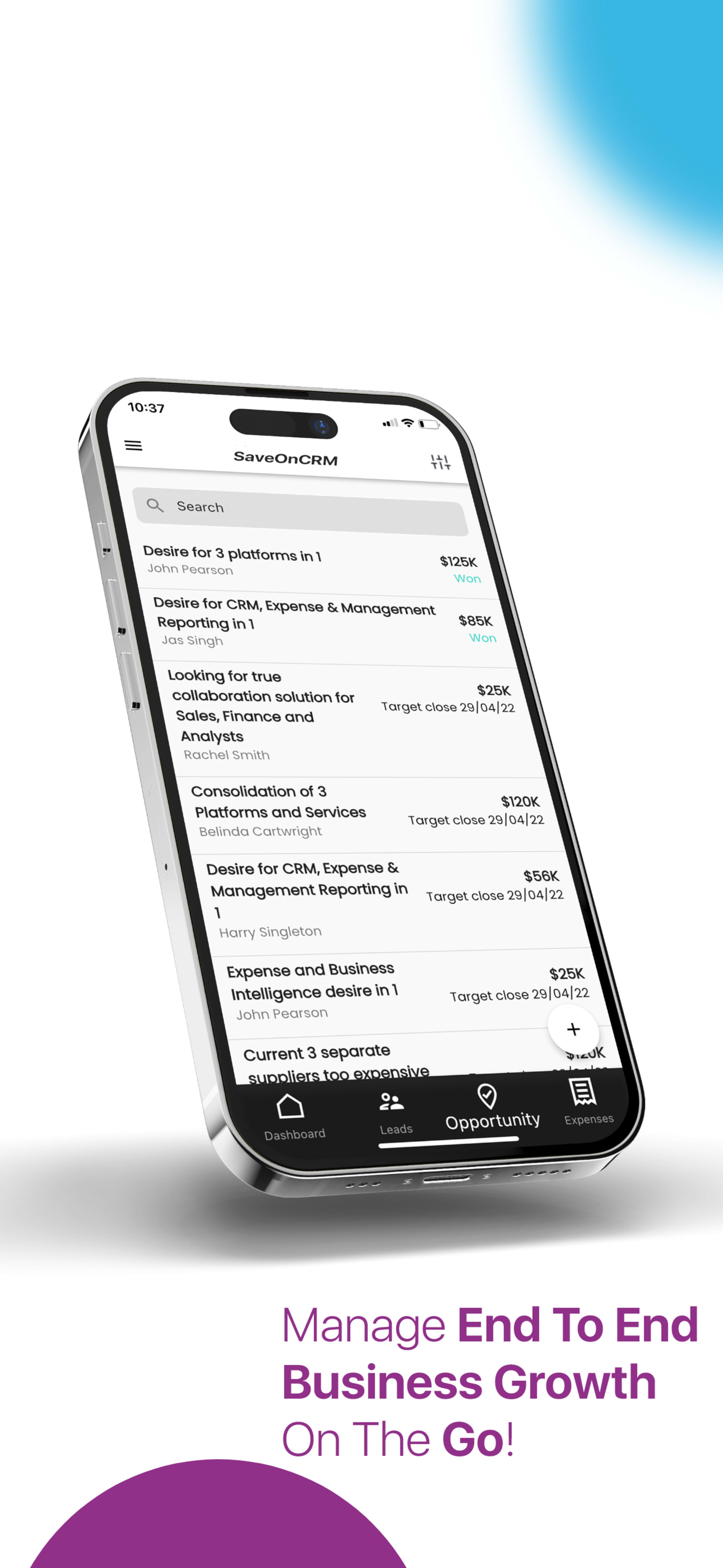
    Re-branded or localized sets from the same templates — the Lucrum CRM set was also produced under the SaveOnCRM name at 1242×2208.

    Variants
  • 06

    Editable templates

    Source files with headlines on their own text layers, so the set can be updated when the interface changes or translated for a new market.

    Source files

The work

The Lucrum CRM screenshot set

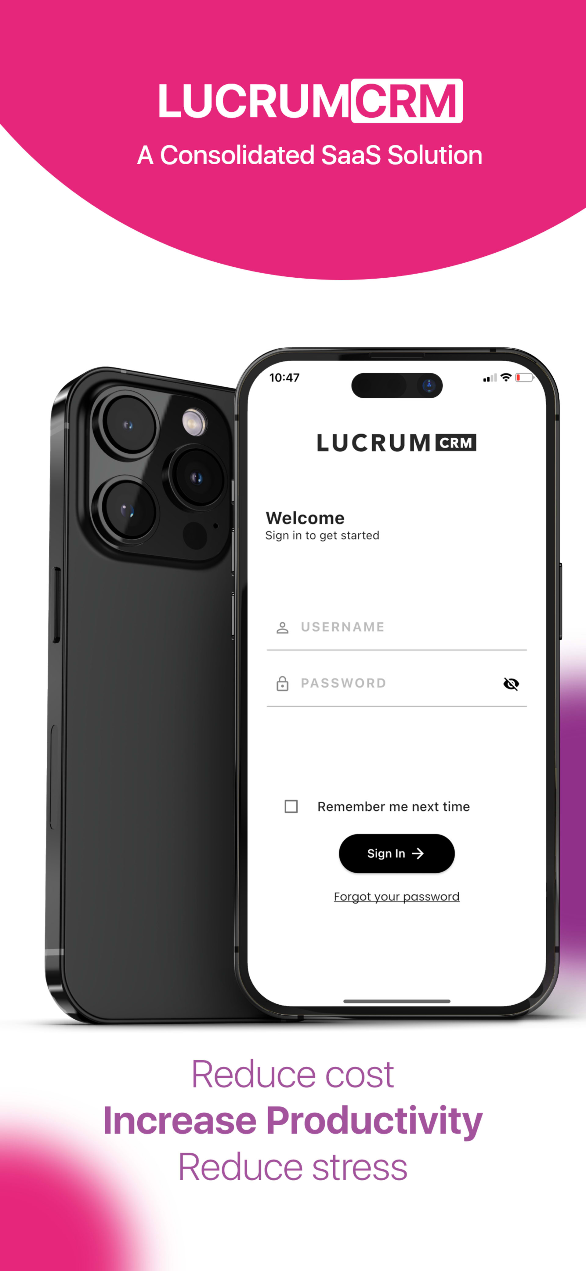
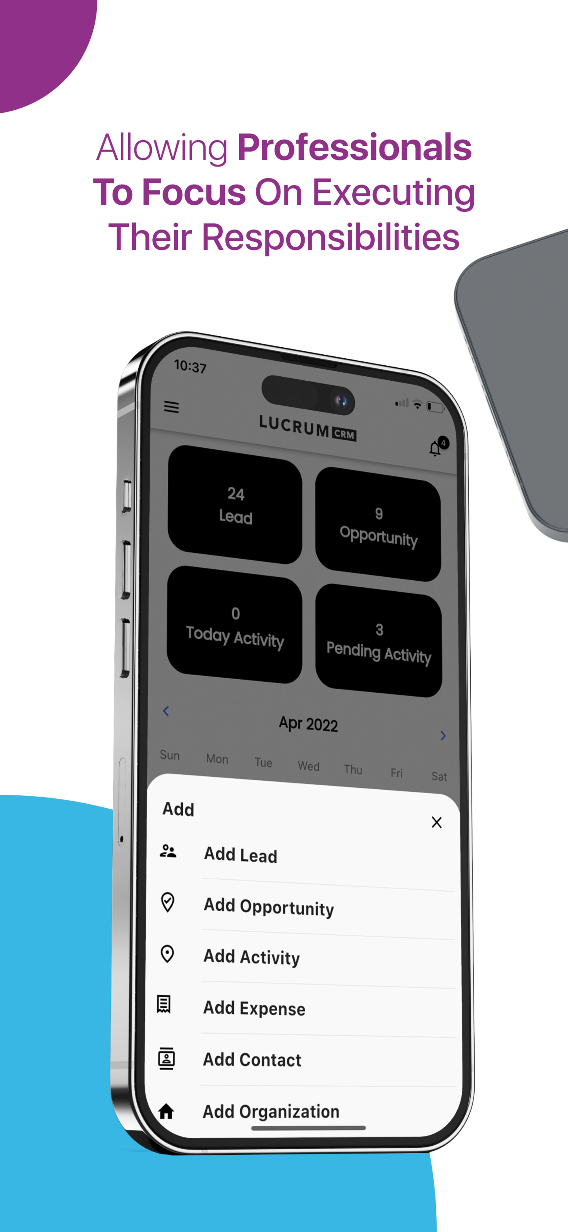
Store-listing screenshots for “a consolidated SaaS solution”: sign-in, dashboard, calendar, leads and expense screens, each with one headline on white with pink, purple and blue accents.

All projects
App store screenshots for Lucrum CRMUI/UX & App Design2025App store screenshots for Lucrum CRMView project

Six screenshots at 1290×2796, six at 1242×2208 and three iPad frames at 2048×2732.

More frames from the set

  • iPhone — Lucrum CRM sign-in
    iPhone — Lucrum CRM sign-in
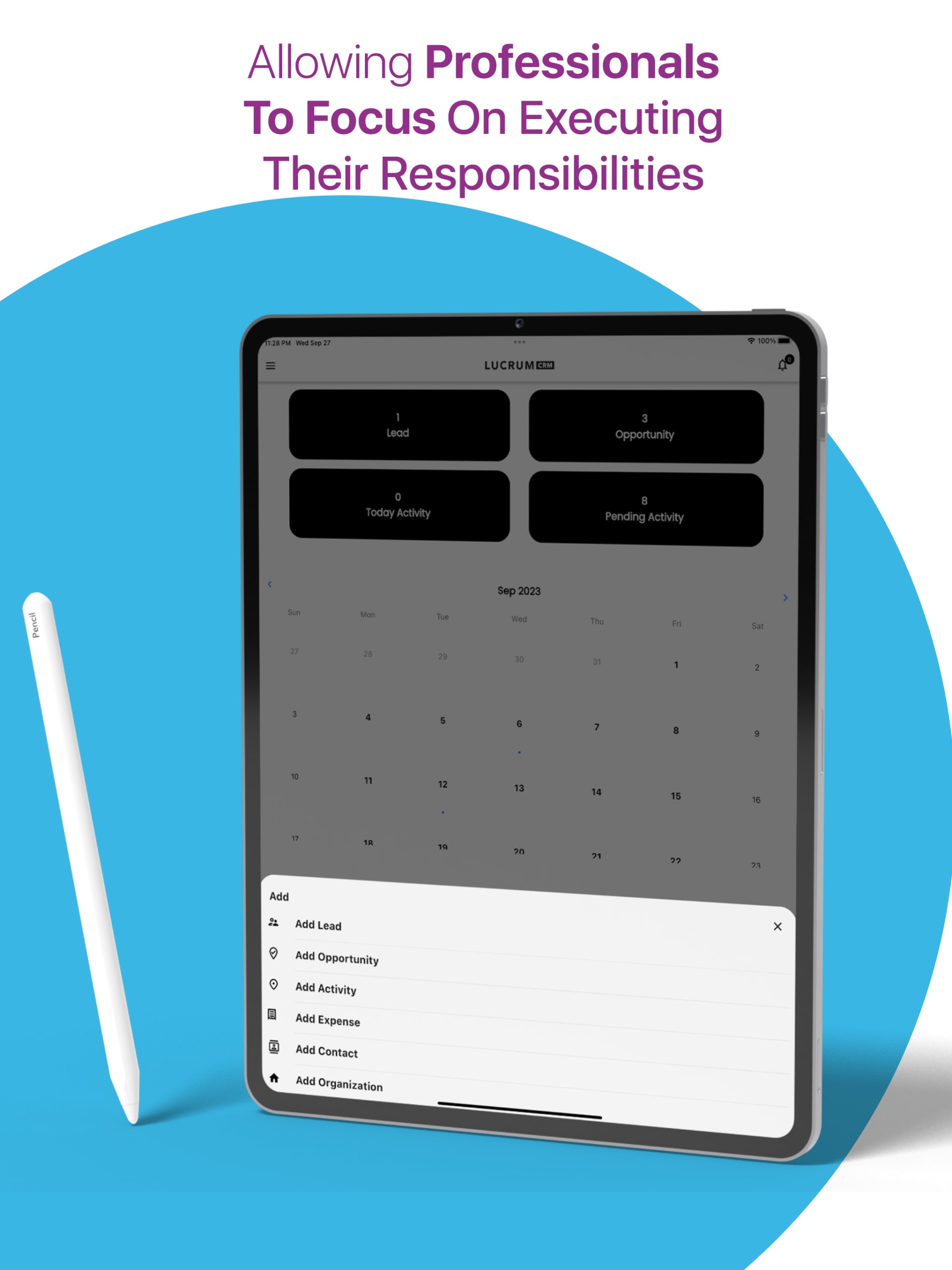
  • iPhone — calendar, “Allowing Professionals to Focus”
    iPhone — calendar, “Allowing Professionals to Focus”
  • iPhone — “Manage End to End Business Growth on the Go”
    iPhone — “Manage End to End Business Growth on the Go”
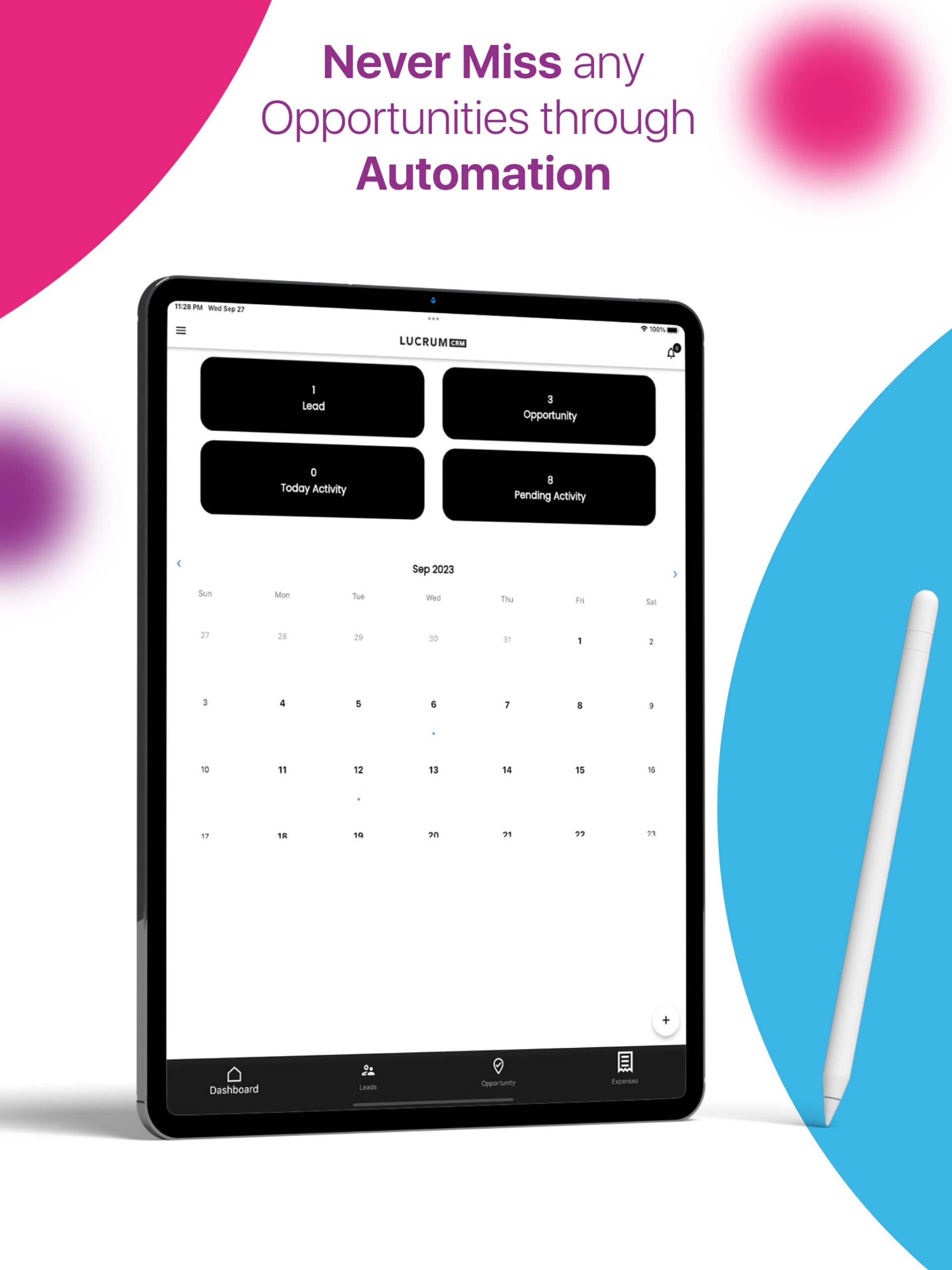
  • iPad — “Never Miss Any Opportunities Through Automation”
    iPad — “Never Miss Any Opportunities Through Automation”
  • iPad — calendar, “Allowing Professionals to Focus”
    iPad — calendar, “Allowing Professionals to Focus”
  • SaveOnCRM — “Tailored Data Dashboard”
    SaveOnCRM — “Tailored Data Dashboard”

Spec sheet

The set, by device size

How the delivered screenshots break down across phone and tablet canvases.

The set, by device size
ProjectPiecesSizes delivered (px)Running time
App store screenshots for Lucrum CRMLucrum CRM151290×2796×61242×2208×62048×2732×3Still images

In depth

01

What a screenshot set has to do

Most people who open a store listing never read the description. They look at the icon, the name, the rating and the first few screenshots, and decide. That makes the screenshot set the real sales page for your app, and it has to work at the size it is first seen — small, in a search result, beside competitors.

Every frame therefore needs two things: a real screen that proves the app exists and looks good, and one short benefit that says why it matters. A list of five features on one screenshot reads as none. One claim, set large, reads at a glance.

Order matters as much as design. We sequence the set like a short pitch: what the app is, the core value, the features that support it, and the outcome — so the first three frames can stand on their own if that is all anyone sees.

02

Inside the Lucrum CRM set

Lucrum CRM describes itself as “a consolidated SaaS solution”, and the set had to make a broad business tool feel specific. Each frame pairs one screen with one headline: “Tailored Data Dashboard” over the analytics view, “Never Miss Any Leads Through Automation” over the leads list, “Allowing Professionals to Focus” over the calendar, “Increase Efficiency With Our Expense Platform” over expenses.

The devices are tilted and layered differently in every frame, so a scrolling row of screenshots never repeats a composition. The palette stays fixed — white ground, pink, purple and blue accents — so the variety reads as one brand.

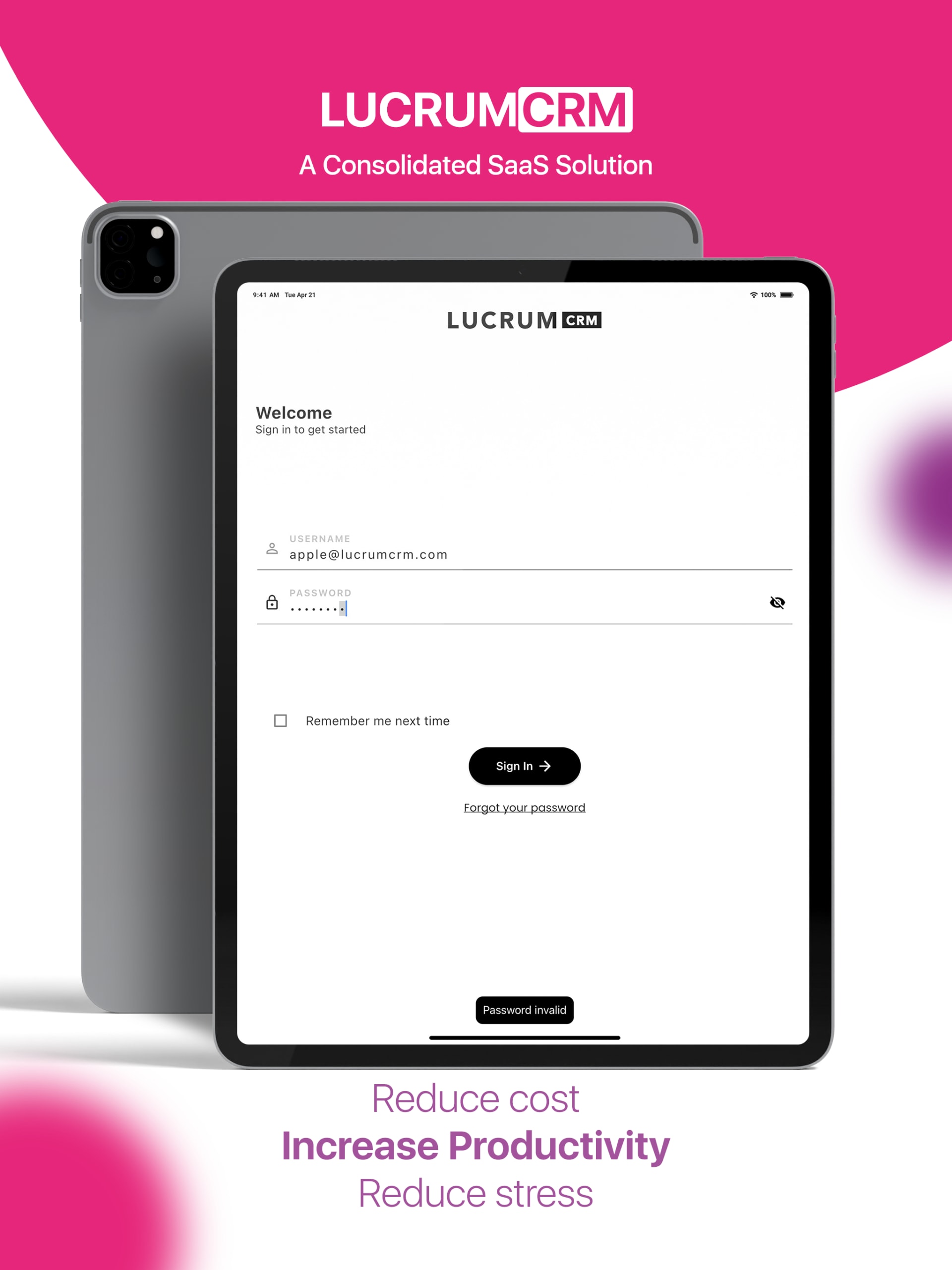
The set was laid out again for each store size rather than scaled from one design: tall 1290×2796 iPhone frames, an older 1242×2208 phone set carrying the SaveOnCRM name, and near-square 2048×2732 iPad frames, where the sign-in screen and its “A Consolidated SaaS Solution” headline open the listing.

03

Sizes and store rules to plan for

Apple asks for screenshots at its largest iPhone and iPad display sizes and scales them down for smaller devices; its current specifications list 1290×2796 among the accepted sizes for the largest iPhones and 2048×2732 for the 13-inch iPad. The App Store takes up to 10 screenshots per device size, and Google Play up to 8 per device type, plus a 1024×500 feature graphic.

Store specifications change as new devices ship, so we check the current requirements for both stores when a project starts and design to them — never to a size list remembered from last year.

  • Decide which stores and devices you are launching on.
  • Pick the screens that prove your core value — usually four to six.
  • Send real screens with realistic demo data, not lorem ipsum.
04

Copy that survives the thumbnail

Screenshot headlines are closer to billboard copy than to interface text. They have to read at a fraction of their designed size, in a fraction of a second.

  • Three to six words, led by the benefit rather than the feature name.
  • One typeface and one weight system across the whole set.
  • High contrast between the headline and its ground.
  • The same headline position on every frame, so the eye knows where to look.
  • No claims the app cannot back up on the very next screen.

Process

How a screenshot set is designed

  1. Step 01

    Listing audit

    We review your current listing, competitors in your category and the screens you want to feature.

  2. Step 02

    Story and copy

    We order the set and write a headline per screenshot, with the first three carrying the pitch.

  3. Step 03

    Hero frame

    One screenshot is designed in full — device, type and color — and approved before the rest.

  4. Step 04

    Every size

    Each device size is laid out on its own canvas, then checked at the size shoppers will see.

  5. Step 05

    Export

    Store-ready PNG or JPG files named by device and order, plus the editable templates.

How every project runs, stage by stage

Pricing

What a screenshot set costs

Starts at

From $1,200

Typical timeline: 1–3 weeks per campaign

A screenshot set is scoped like a campaign design job, from $1,200, and usually takes 1–3 weeks per campaign. If the app’s interface itself needs designing first, that is UI/UX work, from $4,000.

What moves the price

  • Number of screenshots and device sizes
  • Localized or re-branded variants
  • Placing your existing screens, or designing the interface inside the frames
  • Extras such as a Google Play feature graphic

Package

Partner

$9,000+

For ongoing product and app interface design alongside your listing, the Partner package covers both.

Compare all packages

FAQ

App store screenshot questions

What sizes do App Store screenshots need?

Apple asks for screenshots at its largest iPhone and iPad display sizes and scales them down for smaller devices. Our Lucrum CRM set used 1290×2796 for iPhone and 2048×2732 for iPad, plus an older 1242×2208 phone set. We confirm Apple’s current list when we start, because it changes with new devices.

How many screenshots should we upload?

The App Store allows up to 10 per device size and Google Play up to 8. More is not automatically better: the first three do most of the work in search, so we make those carry the pitch and use the rest for depth.

Do you design the app interface as well?

That is a separate service. For a screenshot set we place your existing screens in device frames and design everything around them. If the interface itself needs work first, we can design it as a UI/UX project.

Can you make Google Play screenshots from the same set?

Yes. Google Play uses different proportions and adds a 1024×500 feature graphic, so we re-lay the set rather than stretch it. Tell us both stores at the start and they are designed together.

Can the screenshots be translated?

Yes. Headlines sit on their own text layers in the source files and layouts leave room for longer languages. We can produce localized sets, or hand over templates so your team can.

How much does app store screenshot design cost?

Screenshot sets start from $1,200. The total depends on the number of screens, device sizes and languages, and you get a fixed quote after a free call.

Related

Keep exploring

Next step

Launching or relaunching an app?

Send the store link or your screens. We will come back with a screenshot story, a timeline and a fixed price for the set.